


Herbal Breakfast Bar
Identidade Visual de Marca / Brand Design
_
[PT]
O Herbal é um Breakfast Bar, podendo também ser nomeado como uma casa de brunch, e compreende a proposta de oferecer alimentos frescos, orgânicos e naturais e bebidas como cafés e seus derivados em qualquer momento do dia, seja para desfrutar do ambiente ou para levar para a viagem. A marca pretende ser não-convencional em relação às casas de brunch já existentes no mercado brasileiro. O projeto de identidade visual acompanhou os principais atributos que a marca intenciona comunicar: caráter industrial e rústico ao mesmo tempo que carrega traços corteses. Assim, fazem parte do universo do Herbal embalagens de papel kraft e mobiliário em madeira e metal, que trazem essas sensações.
Além disso, duas ilustrações foram definidas como elementos complementares para o projeto: a romã e o abacate foram os alimentos escolhidos para este fim por serem capazes de transmitir o frescor que a marca quer imputar e por serem dois ingredientes bastante presentes no cardápio do Herbal. Tais ilustrações são representadas em forma de aquarela para que abordassem certo aspecto amigável e quebrassem com a rigidez do posicionamento industrial que os outros elementos da marca carregam, de maneira a equilibrá-los.
_
[EN]
Herbal is a Breakfast Bar, which can also be named as a brunch house, and comprises the proposal to offer fresh, organic and natural foods and beverages such as coffee and its derivatives at any time of the day, whether to enjoy the atmosphere or to take away. The brand intends to be unconventional in relation to brunch houses already existing in the Brazilian market. The visual identity project followed the main attributes that the brand intends to communicate: industrial and rustic character while carrying courteous traits. Thus, kraft paper packaging and wooden and metal furniture are part of the Herbal universe, which bring such sensations.
In addition, two illustrations were defined as complementary elements for the project: the pomegranate and the avocado were the foods chosen for this purpose because they are able to convey the freshness that the brand wants to attribute and because they are two very present ingredients in Herbal's menu. Such illustrations are represented in watercolor form so that they approach a certain friendly aspect and break with the rigidity of the industrial positioning that the other elements of the brand carry, in order to balance them.


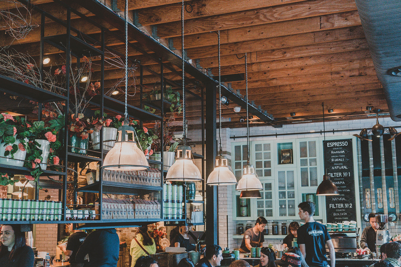
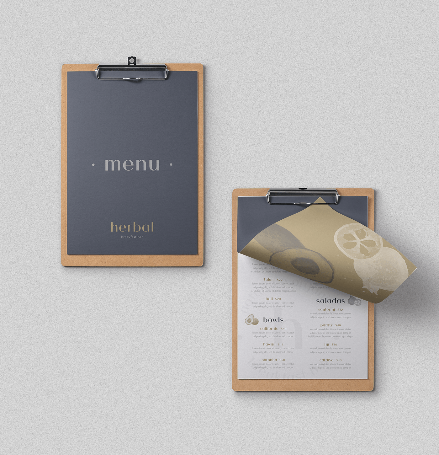

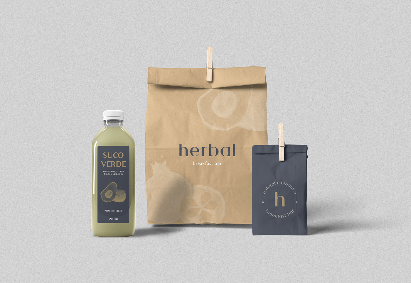
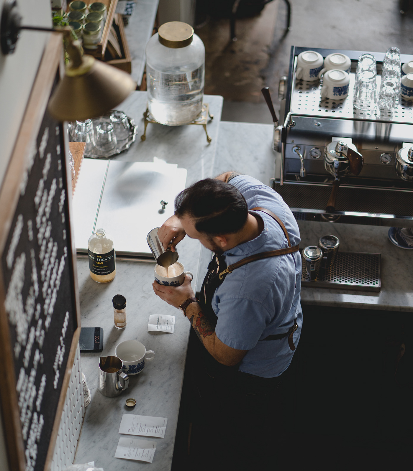
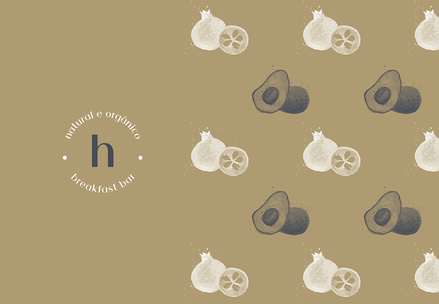
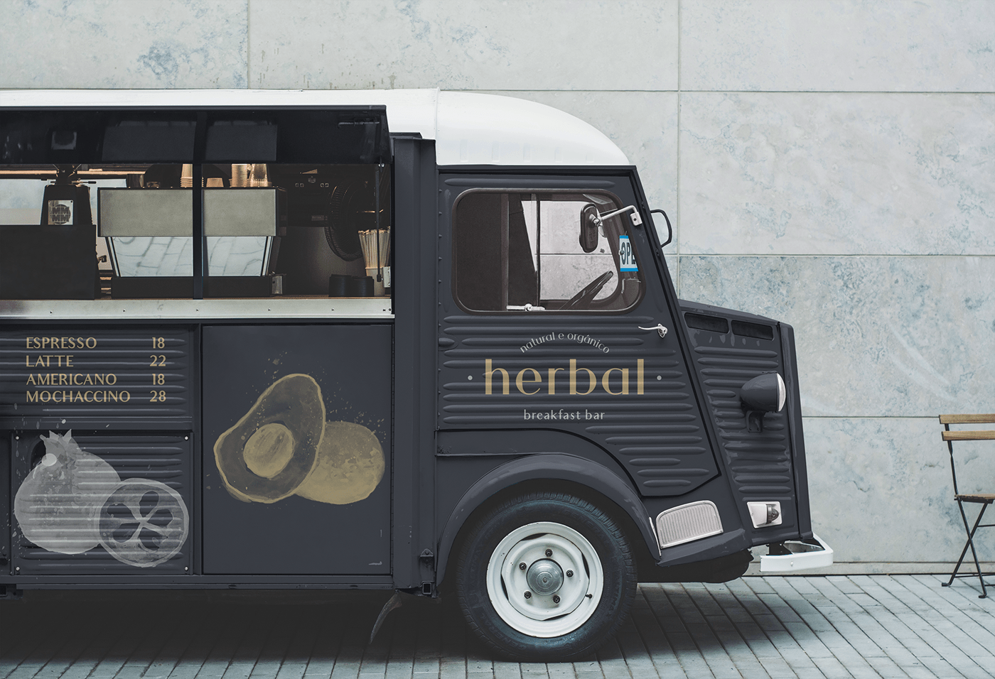
*Image & Illustration Sources: Unsplash, Pexels, Pinterest & Freepik
Obrigada por ver este projeto! / Thank you for viewing this!
Veja mais do meu trabalho abaixo ou me envie um e-mail caso esteja interessado em criar sua marca comigo!
See more of my work below or email me if you are interested in creating your brand with me!


